


“We’ve got too much text on these slides. Let’s throw in some images.”
Sounds familiar? If you’ve worked in L&D, it probably does.
While multimedia can surely improve the readability and visual appeal of your content, it’s not always the solution:
- Not everything can be conveyed with imagery; a ton of flashy multimedia might not add any value to your content.
- The multimedia you have available might not align with your content – it could jar with your message and even confuse your point.
- If your content is heavy with rich media, it can cause cognitive overload for learners, making it harder to reflect on and retain information.
Here’s some top tips for turning walls of text into attention-grabbing slides.
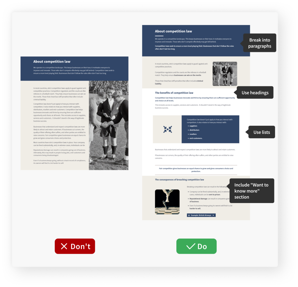
Top tip #1: Break it down
By breaking lengthy blocks of text into bite-sized chunks, you can give learners a sense of progress and make your content more approachable.
-
Stick to one idea per paragraphKeep each paragraph focused on a single idea or topic.
-
Use subheadings
Clear subheadings frame the learner’s attention on the key messages.
-
Use bullet points or numbered lists
Keep each item brief to maintain clarity and readability.
-
Include additional information in the “Want to know more” section
This will help maintain focus on the key messages and provide a smoother learning flow.
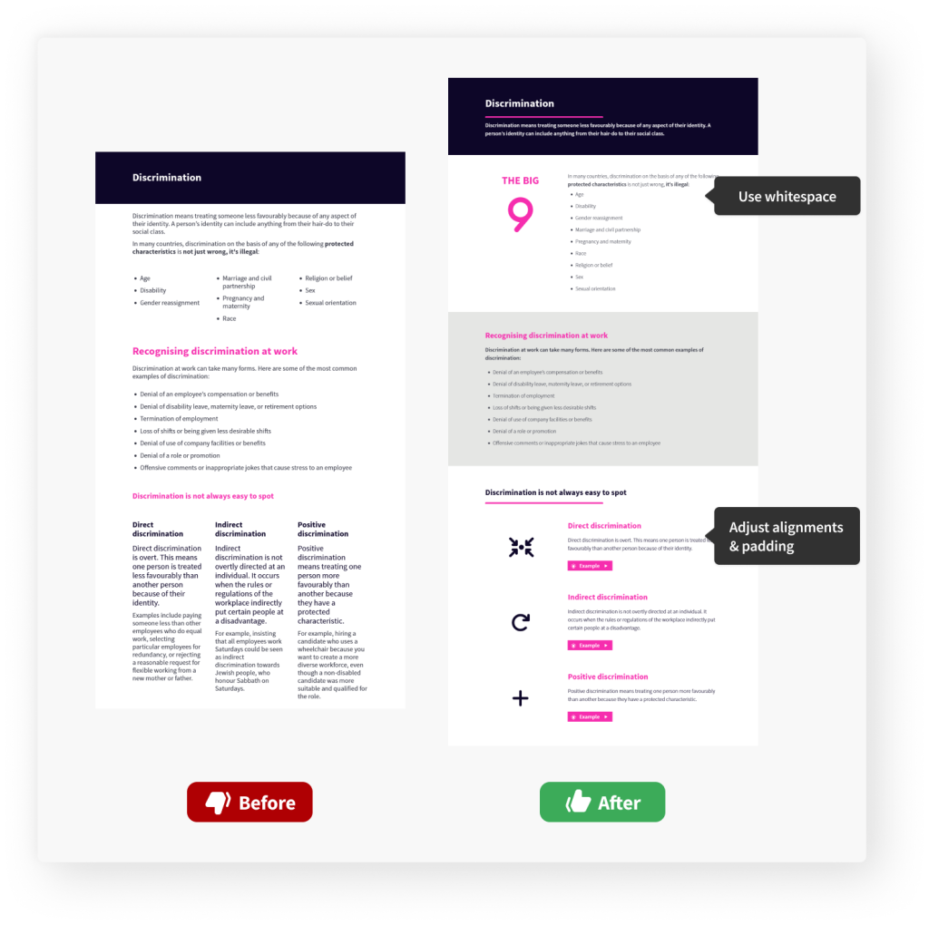
Top tip #2: Think about layout
By thoughtfully designing the layout of your learning, you can guide learners through the content in a logical and organised manner, helping them grasp the key concepts more effectively.
-
Use whitespace effectivelyGive your content room to breathe by cleverly incorporating whitespace.
-
Aim for a comfortable reading with alignments and padding
Use centre alignment for short text only (like titles or pull-out points) and avoid making text rows too narrow or spread out.
-
Test on different screen sizes
Remember that e-learning content should be accessible on various devices with different screen sizes.
JollyDeck hint: JollyDeck Create enables you to preview your content on screens of different sizes while building it.
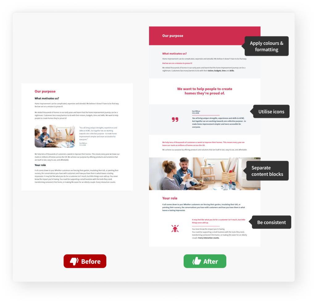
Top tip #3: Make visual enhancements
Visual elements are key to improving content readability.
Skillfully employing formatting techniques and visual separators is often more impactful than flashy multimedia.
-
Apply colours and formatting techniquesHighlight important information with colours and formatting.
-
Visually separate text blocks
Separate text blocks and create clear sections by applying different backgrounds and text colours and using line separators and whitespace.
-
Utilise icons
Use icons to separate blocks of text, to support key messages, and to avoid excessive white space.
JollyDeck hint: Browse, select and adapt icons straight from JollyDeck Create.
-
Be consistent with formatting
Consistently apply headings, subheadings, bullet points, and other formatting elements.
JollyDeck hint: JollyDeck Create offers you templated elements and predetermined formatting with your chosen colour scheme, so you can keep your content consistent.
The strength of multimedia
Multimedia such as images, videos, and interactive graphics promote learners’ engagement, help visualise abstract ideas, and deepen their understanding.
But this isn’t a quick fix!
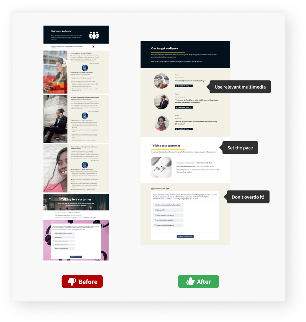
Multimedia won’t magically make your text-heavy slide attractive. You need to be mindful of how you use it.Top tip #4: Embrace the power of visuals
Screens with too much media can quickly cause cognitive overload. To avoid this, it is essential to use multimedia in a way that does not overwhelm the learner’s working memory.
-
Only include relevant multimedia
Use multimedia and interactive elements that serve a specific purpose, align with your text, and support your key messages.
JollyDeck hint: JollyDeck Create comes with an in-built library of photos and icons, plus a rich collection of interactive elements.
Set the mood and paceUse multimedia to set the mood or slow down the pace of information delivery.
Don’t overdo it!Less is almost always more. Strike a balance between using multimedia, text and whitespace.
The sweet bonus
Using the advice above will not only make your content look better, but also help you “tidy it up”. Reviewing your content offers a great chance for a clean-up. You can get rid of or make simpler anything that seems too much. The end result will be a cleaner, more effective learning experience.
So, can text-heavy content ever be learner-friendly?
Absolutely.
Using multimedia, white space and formatting effectively, you can create compelling e-learning, even if you have lots of information to get across and little multimedia to support it.
Still not convinced? Here are some more examples to prove that text-heavy content CAN be learner-friendly:
Struggling with a text-heavy slide?
Challenge accepted!
Send your content over to support@jollydeck.com and our team will work their magic using only JollyDeck Create.
-