
Text-heavy slides can quickly feel overwhelming for learners, even when the content is useful. It’s easy to think the solution is more visuals or multimedia. But that can often create more noise than clarity.
That’s why we have prepared practical tips and JollyDeck hints to help you turn text-heavy content into clear, engaging, and learner-friendly slides.
Images won’t fix this
“We’ve got too much text on these slides. Let’s throw in some images.”
Sounds familiar? If you’ve worked in L&D, it probably does.
While multimedia can certainly improve readability and visual appeal, it’s not always the answer:
- Not everything can be effectively conveyed through imagery. And a lot of flashy multimedia doesn’t necessarily add value.
- Sometimes, the multimedia available simply doesn’t align with your content. Instead of supporting your message, it can clash with it or even create confusion.
- And when content is overloaded with rich media, it can lead to cognitive overload, making it harder for learners to process, reflect on, and retain information.
The point is, you don’t need fancy visuals to transform text-heavy content into compelling slides.
Here’s some top tips for turning walls of text into attention-grabbing slides.
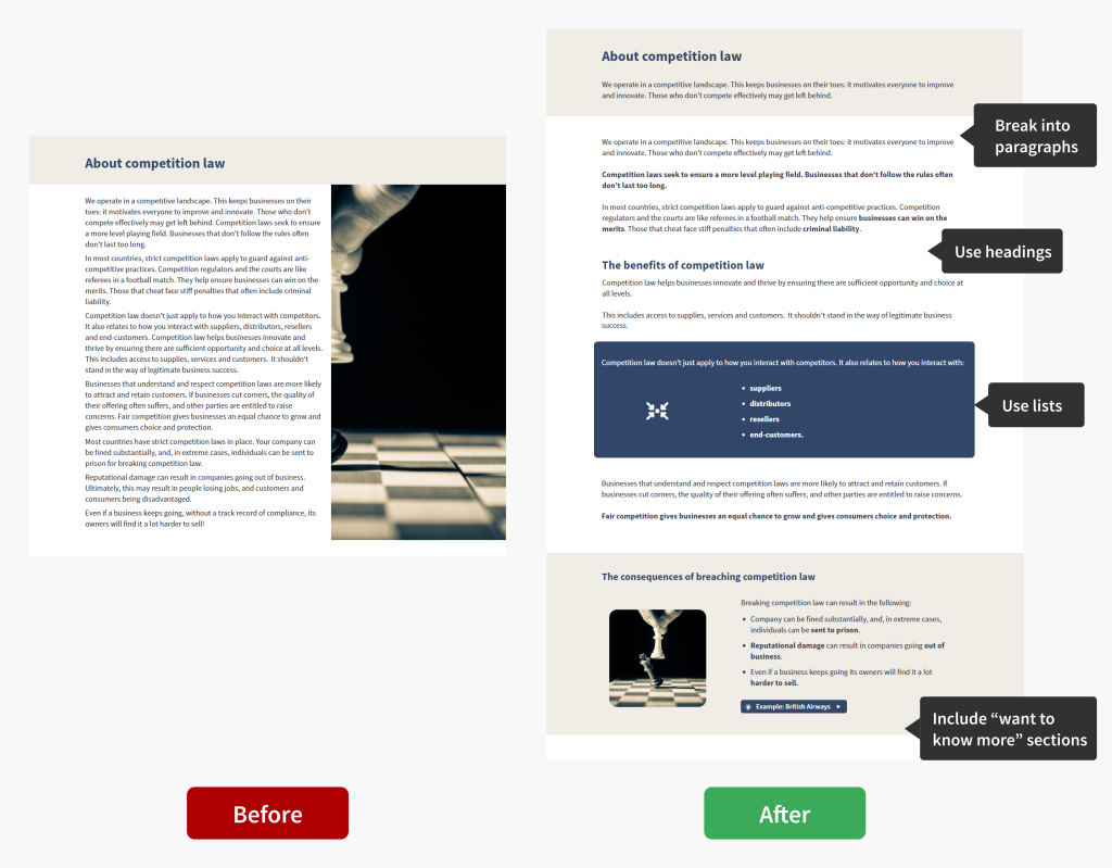
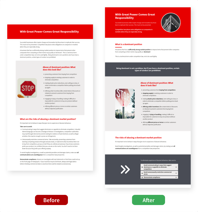
Top tip #1: Break it down
Breaking long blocks of text into bite-sized chunks makes content feel more manageable and gives learners a sense of progress.
-
Stick to one idea per paragraphKeep each paragraph focused on a single idea or topic.
-
Use subheadings
Clear subheadings help direct attention to key messages.
-
Use bullet points or numbered lists
Keep each item concise to maintain clarity and readability.
-
Move extra detail into a “Want to know more?” section
This keeps the main content focused while still offering depth for those who want it.
Use interactive links to add extra detail through drop-down sections, pop-up slides, and more.
Here’s an example of what this looks like in practice:
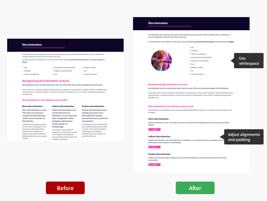
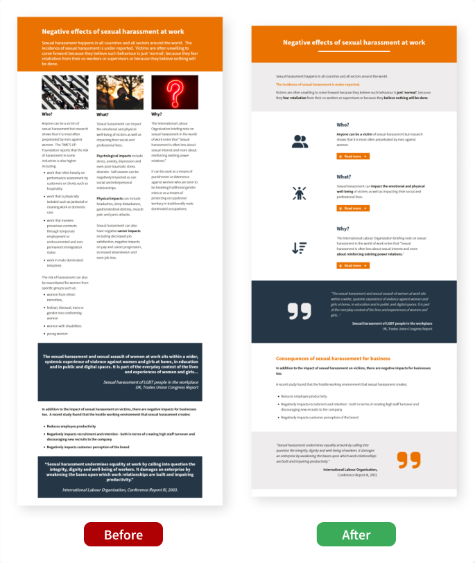
Top tip #2: Think about layout
A well-designed layout helps guide learners through the content in a logical, structured way, making key concepts easier to understand.
-
Use whitespace effectivelyGive your content room to breathe.
-
Aim for a comfortable reading with alignments and padding
Use centre alignment for short text only (for titles or short highlights) and avoid making text rows too narrow or spread out.
-
Test on different screen sizes
E-learning content should work seamlessly on different devices.
As you build your course, use the Preview tab to switch between devices and see how your content performs across different screen sizes.
Let’s see how this translates into practice:
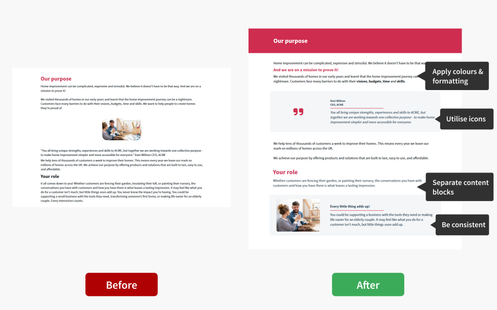
Top tip #3: Make visual enhancements
Visual elements are key to improving content readability.
Skillfully employing formatting techniques and visual separators is often more impactful than flashy multimedia.
-
Use colour and formatting intentionallyHighlight key information with colours and formatting to guide attention.
-
Visually separate text blocks
Use backgrounds, line separators, and whitespace to create clear sections.
-
Utilise icons
Icons can break up text, reinforce key points, and reduce visual monotony.
-
Stay consistent
Apply headings, subheadings, bullet points and formatting styles consistently throughout.
JollyDeck Create offers templated elements and rows to help you maintain consistency across your content. Don’t forget about keyboard shortcuts to quickly reuse already designed rows throughout your course.
Let’s see this in action:
The strength of multimedia
Multimedia such as images, videos, and interactive elements promote engagement, bring abstract ideas to life, and deepen understanding.
But it’s not a quick fix.
Multimedia won’t magically make a text-heavy slide engaging. You need to be mindful of how you use it.
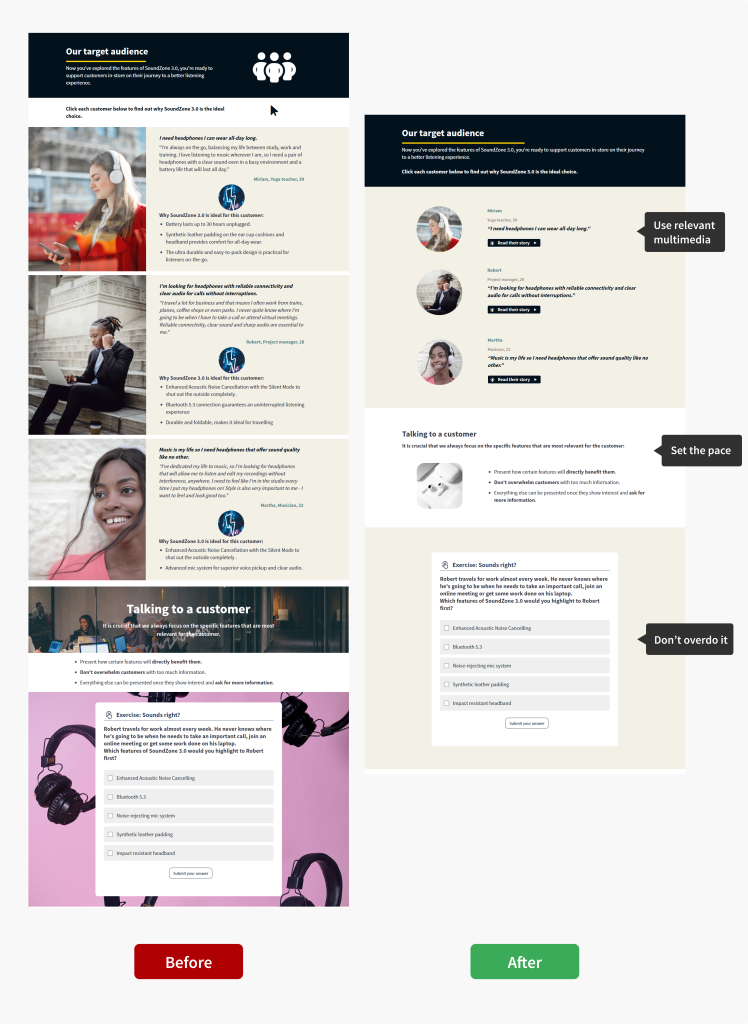
Top tip #4: Embrace the power of visuals
Too much media can overwhelm learners, causing cognitive overload and strain on their working memory. The key is balance.
-
Only include relevant multimedia
Every element should serve a clear purpose and support your key message.
Set the mood and paceUse multimedia to set the mood or slow down the pace of information delivery.
Don’t overdo it!Less is almost always more. Aim for the right balance between text, visuals, and whitespace.
JollyDeck hint:
Search for relevant visuals in the built-in library of photos, icons, and interactive elements, or generate your own images using AI Copilot, all within JollyDeck Create.How this works in practice:
A note on videos
Video can be a powerful way to support learning. Especially when you’re dealing with complex or content-heavy topics. It can help clarify ideas, add context, and make information easier to follow. But, like any form of multimedia, it works best when used with intention.
Used well, video can break up dense content and give learners a different way to engage with key messages, without overwhelming them.
With JollyDeck’s AI video authoring tool, you can create videos directly inside your e-learning environment. This makes it easy to combine the power of speech with visuals, helping you present complex information in a clear and digestible way.
So, can text-heavy content ever be learner-friendly?
Absolutely.
With thoughtful use of structure, whitespace, formatting, and multimedia, you can create compelling e-learning, even when you have a lot to say and limited visual assets.
Still not convinced? Here is a couple of more examples that prove text-heavy content can be learner-friendly:
Struggling with a text-heavy slide?
Challenge accepted!
Send us a link to your slide and our team will work their magic using only JollyDeck Create.